Material Design: The color system
- tags: Design,Material Design: Tools for picking colorsMaterial Design
- source: Material Design. “Material Design.” Accessed February 12, 2022. https://material.io/design/color/the-color-system.html#color-usage-and-palettes.
Principles⌗
-
Hierarchical
Color indicates which elements are interactive, how they relate to other elements, and their level of prominence. Important elements should stand out the most.
-
Legible
Text and import elements, like icons, should meet legibility standards when appearing on colored backgrounds.
-
Expressive
Show brand colors at memorable moments that reinforce your brand’s style.
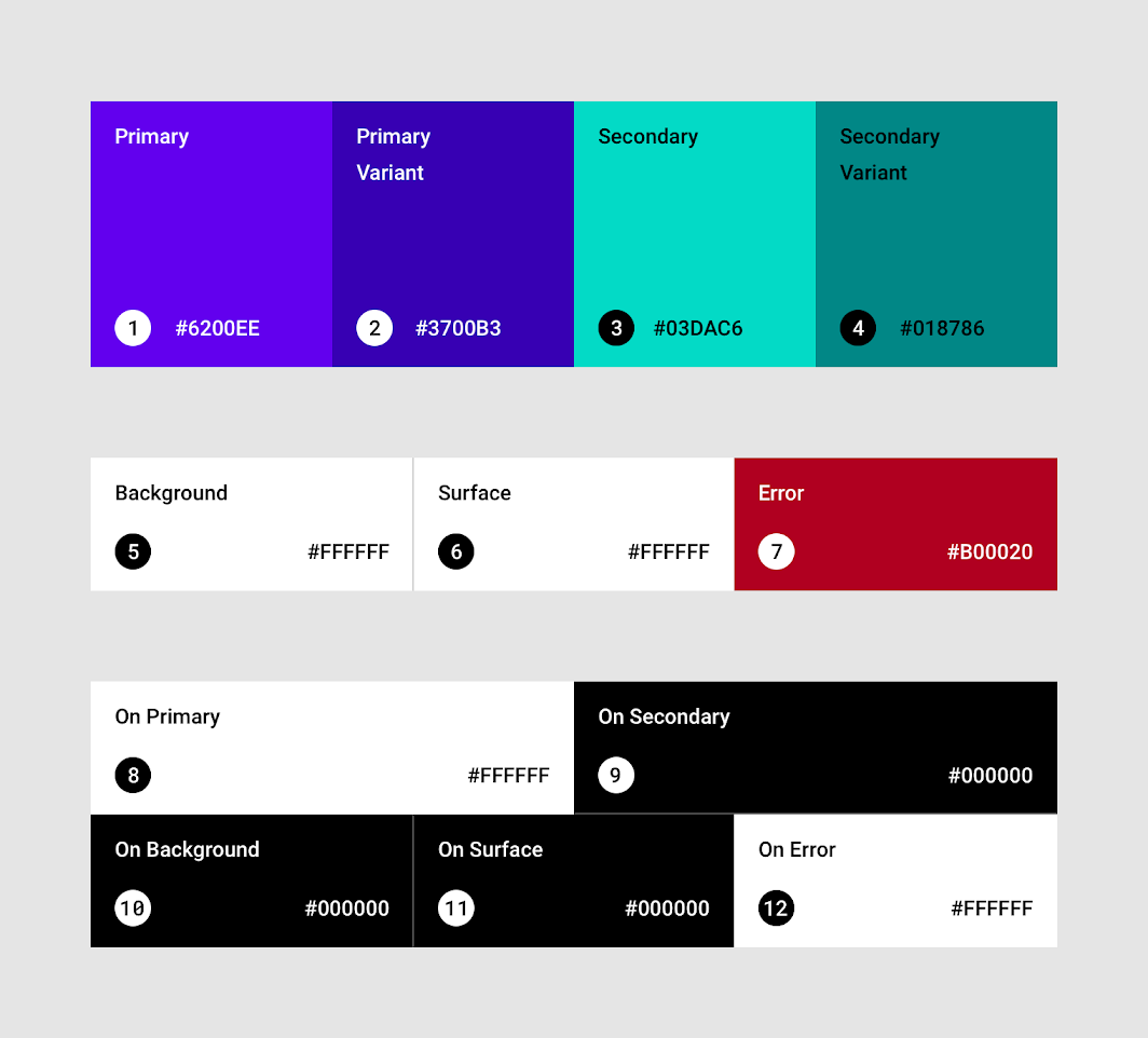
Colors we need⌗
-
Primary colors
- screens and components
-
Variants of primary colors
- Dark and light primary variants
-
Secondary colors
- Floating action buttons
- Selection controls, like sliders and switches
- Highlighting selected text
- Progress bars
- Links and headlines
-
Variants of secondary colors (optional)
-
Additional UI colors, such as colors for backgrounds, surfaces, errors, typography, and iconography.
- Surface colors affect surfaces of components, such as cards, sheets, and menus.
- The background color appears behind scrollable content. The baseline background and surface color is #FFFFFF.
- Error color indicates errors in components, such as invalid text in a text field. The baseline error color is #B00020.